
A logo does not mean anything. This is not a provocation, it is the founding insight of an entire academic discipline. A shape, a colour, or a mark carries meaning only because a market has agreed, collectively and mostly without noticing, that it should. Change the market, and the agreement can quietly disappear, taking the meaning with it.
Most brand identity conversations skip straight past this and treat a logo as if its meaning were self-evident once the design is finished. A well-designed mark, in this view, simply communicates what it is meant to communicate, everywhere, automatically. Semiotics, the academic study of how signs generate meaning, was built specifically to dismantle that assumption, and it does so with more precision than most brand strategy conversations ever reach.
The Idea That Meaning Is Not in the Object
Semiotics is the study of signs, and it rests on a founding insight from the Swiss linguist Ferdinand de Saussure: every sign is made of two parts, a signifier (the physical form, a word, a sound, an image) and a signified (the concept it triggers in someone's mind). Saussure's central and still-debated claim is that the relationship between the two is arbitrary. There is no natural reason the sound “tree” should refer to a tall woody plant. A different language uses a completely different sound for the same concept, and both work equally well, because meaning comes from convention, not from any inherent connection between sign and concept.
The American philosopher Charles Sanders Peirce developed a parallel, and in some ways more complete, model around the same period. Peirce described a three-part relationship between a sign, the object it represents, and the interpretant, the understanding it produces in the mind of whoever encounters it. Peirce also classified signs into three types: an icon resembles what it represents (a photograph, a realistic drawing), an index has a direct causal or physical connection to what it represents (smoke as an index of fire), and a symbol has a purely conventional connection that has to be learned (a word, a flag, most logos).
A logo is, in Peirce's terms, almost always a symbol. Its connection to the business it represents is not natural or automatic. It has to be taught, repeated, and reinforced until a market learns to associate the mark with the meaning a brand wants attached to it. Until that learning happens, or if it happens incorrectly, or if it happens against a different, pre-existing cultural code, the mark communicates something else entirely, sometimes something the brand never intended.
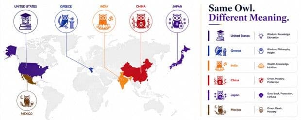
This has a practical consequence most brand guidelines never state directly. A new logo does not arrive in a market as a blank slate waiting to absorb whatever meaning a brand assigns to it. It arrives into a market that has already spent years, sometimes generations, building associations around similar shapes, colours, and symbols through religious iconography, competitor branding, packaging conventions, and everyday visual culture. A new mark is read against that existing code from the first moment it appears, whether or not the brand designing it accounted for that code at all.
When the Code Doesn't Match: Documented Cases of Symbols Losing Their Meaning
This is not a theoretical risk. It has happened to some of the most sophisticated brand teams in the world, not because they were careless, but because a symbol that carries one meaning in the market it was designed for can carry a completely different one in a market it was not.
A Global Diaper Brand's Stork Imagery
A major global diaper brand had to rebrand its packaging in Japan after its stork imagery, an image of a stork delivering a baby that carries obvious meaning across much of the Western world, failed to resonate at all, as Zinklar's analysis of cross-cultural brand extensions documents. In Japanese folklore, babies are not delivered by storks. The far more familiar cultural reference is of giant peaches carrying babies to their parents. The stork was not offensive or confusing in a dramatic way, it was simply a symbol with no established referent in that market's existing code, a signifier attached to a signified that the local audience had never learned.
A Home-Sharing Platform's Rebrand, and the Twelve-Country Testing Process Built Specifically to Avoid This
A 2014 rebrand by a major global home-sharing platform is one of the most cross-culturally rigorous logo projects on record precisely because the company understood this risk directly. As documented in a review of major logo design case studies, its design agency conducted more than 1,000 interviews across 12 countries during the design process, largely to check that the new symbol did not carry an unintended or offensive meaning in any of the markets the company operated in. That level of testing is not standard practice for most rebrands. It became necessary specifically because a simple abstract shape, exactly the kind of mark most likely to be read differently across different cultural codes, has no built-in protection against being misread. The meaning had to be checked, market by market, rather than assumed.
A Baby Food Brand's Packaging Entering New Markets
A well-known baby food brand's baby-face jar label, instantly recognisable and entirely unremarkable in the United States, is widely cited in cross-cultural marketing literature as an example of a symbol that behaves differently once local labelling conventions differ. In markets where product packaging traditionally carries an image of the actual contents inside, an image on the outside of a jar functions as an index in Peirce's sense, a direct sign of what is inside, rather than as an icon of an intended customer or brand mascot. This example is repeated often enough across marketing case studies that it is worth treating as illustrative of the underlying mechanism rather than as a precisely documented single incident, but the mechanism itself, an image whose meaning depends entirely on local packaging convention, is exactly the semiotic risk this piece is describing.
Why the Same Colour or Shape Can Mean Different Things in Different Markets
None of this requires an unusual symbol or an unfamiliar market to be true. Colour, shape, and typography all function as signifiers with culturally learned, not universal, signifieds. A colour that reads as trustworthy and premium in one cultural context can read as inexpensive, or as carrying an entirely unrelated association, in another, purely because different markets have built different conventions around what that colour has historically been used to represent. Semiotics is the layer underneath why brands often measure recognition by colour and shape separately: recognition and meaning are not the same test, and a mark can be perfectly recognisable while still signifying the wrong thing to a given audience. This is precisely why global brands maintain regional design guidelines rather than a single fixed palette applied uniformly everywhere, and why a logo or colour choice that tested well in one market cannot be assumed to carry the same meaning in the next one without being checked.
For a business operating across India specifically, this matters at a level below the national brand identity too. A market is not a single homogenous code. Regional language, religious symbolism, festival associations, and even locally dominant competitor colours all shape what a given visual choice signifies in one state or city compared to another, in the same way that the home-sharing platform discussed earlier had to check its symbol market by market rather than assuming a single global read.
A Framework for Reading Your Own Brand Semiotically
1. Separate the signifier from the signified
List what your logo, colour, or symbol actually is (its physical form) separately from what you intend it to mean. This sounds obvious until it is written down, at which point it usually becomes clear how much of the intended meaning exists only in an internal brand document, not in the mind of an actual customer.
2. Test the mark against a market's existing code, not in isolation
A symbol is never read in a vacuum. It is read against everything else a market has already learned to associate with that shape, colour, or image. Testing a new mark only for whether people find it visually appealing, without checking what it already means to them from unrelated contexts, misses exactly the risk that affected the diaper brand's packaging in Japan.
3. Check for pre-existing indexical readings
Ask specifically whether your image or symbol could be read as a direct, literal sign of something (an index, in Peirce's terms) rather than as the abstract brand association you intend (a symbol). The baby food brand's experience described earlier is the clearest illustration of this specific failure mode.
4. Budget for market-by-market interpretation testing, not just visual preference testing
The 12-country interview process described earlier is an extreme version of a principle that applies at any scale. A mark's meaning should be confirmed in each significant market it will operate in, not assumed to transfer from the market it was originally designed for.
5. Revisit the code periodically, not only at launch
Cultural codes shift. A colour, symbol, or phrase that carried a stable meaning when a brand identity was built can drift as the surrounding culture changes, as competitors enter the same visual territory, or as a symbol takes on new associations through events entirely outside a brand's control. Semiotic risk is not a one-time launch check, it is a standing question.
6. Document the code, not only the guidelines
Most brand guidelines document rules: which colour, which spacing, which typeface. Few document the reasoning, what each element is intended to signify, and to whom. A written record of the intended signified behind every signifier makes it possible to audit, years later, whether the market's actual reading still matches the brand's original intention, or whether the two have quietly drifted apart.
What This Looks Like in Practice
Consider a hypothetical, though realistic, scenario: a wellness or D2C brand launches nationally in India with a single fixed colour palette and mascot chosen because it tested well with a founding team based in one city. The mark performs exactly as intended in that city and in others with a similar cultural and linguistic backdrop. In a different region, the same colour carries an association the founding team had never encountered, tied to a locally dominant competitor, a religious context, or a regional convention around what that colour typically signals on packaging. Sales data alone will show this as underperformance in that region. Only a semiotic read, asking what the mark actually signifies there rather than what it was designed to signify, explains why.
The fix is rarely a full rebrand. It is usually a regional adaptation layer, a secondary palette, a locally tested tagline, or an adjusted mascot context, built on top of a consistent core identity rather than replacing it. This is the same logic applied at a global scale by the home-sharing platform discussed earlier, treating the underlying idea as fixed while checking, market by market, that the specific signifier chosen to express it actually lands the way it is meant to.
Why This Matters for AI Visibility Too
There is a newer, less obvious version of this same risk. As AI answer engines like ChatGPT, Gemini, and Google's AI Overviews increasingly summarise what a brand is and stands for, they draw on whatever text exists about that brand across the web, reviews, articles, forum discussions, social commentary. If a brand's visual identity has been misread in a given region or language community, that misreading does not stay contained to the people who saw the logo. It becomes text, written by confused or critical customers, and that text becomes part of the material an AI model learns to associate with the brand when it answers a question about it in that language. A semiotic mismatch that once cost a brand a single confused customer can now compound into training material an AI model repeats indefinitely.
Where This Connects Back to the Work
This is the deeper argument underneath most of MagicWorks' brand identity, research, and publishing work: a logo, a colour palette, or a tagline is never evaluated by MagicWorks purely on whether it looks appealing in a mockup. It is evaluated on whether the market it is entering already has a code that will receive it the way it is intended to be received, and where that code does not yet exist, on how deliberately it needs to be built rather than assumed, working alongside MagicWorks' broader digital marketing strategy for the same brand.
A logo means nothing on its own. It means something only once a market has learned to read it a particular way, and that reading has to be earned and checked, not designed once and trusted forever.
Build Your Brand's Documented Semiotic Code
If your brand doesn't yet have a documented semiotic code, the six-point framework above is a starting point. Building and maintaining one properly, across markets, regions, and campaigns, is what MagicWorks' brand guidelines development work is for, delivered alongside MagicWorks' digital marketing strategy so the guidelines a brand builds and the campaigns it runs are checked against the same market-by-market reading, not two separate exercises.
Purva Desai is a Digital Marketing Executive at MagicWorks IT Solutions, Pune, working across SEO, AEO, GEO, brand strategy, and content strategy.