Your website loads in under two seconds. Every speed test says you are fine. And still, most of your visitors leave without clicking a single thing (RiseCraft Digital, 2026). If you have ever stared at that gap between good technical scores and bad real-world numbers, the explanation is not hiding in your server logs. It is hiding in your visitors' heads, and learning to reduce website bounce rate through psychology, not just speed, is where most businesses are looking in the wrong place.
Speed Still Matters, But Not the Way You Think
The raw numbers on load time are dramatic enough on their own. Bounce probability rises by 32% when load time increases from one second to three, and by up to 123% as it stretches toward ten seconds (Site Builder Report, 2026). A single one-second delay in page response can reduce conversions by roughly 7%, which on a site generating a modest six figures in daily revenue can translate into millions of dollars in lost revenue over a year (Hostinger, 2026, citing Google and Kissmetrics data).
But speed alone does not explain why a fast, well-optimised site can still lose 71% of visitors without a single action taken (RiseCraft Digital, 2026, a figure worth treating with some caution given it comes from a single agency's blog rather than an independently published study). A page can pass every technical benchmark and still fail the only test that actually matters: whether a human brain, in the first few seconds, decides staying is worth the effort.
The Real Culprit Is Cognitive Load, Not Load Time
This is where a well-established principle in psychology, Hick's Law, becomes directly relevant to your homepage. Hick's Law states that the time it takes someone to make a decision increases logarithmically with the number and complexity of the choices in front of them (CopyAdsContent, 2026). A homepage with six navigation items, three competing calls to action, and a hero section trying to say five things at once is not being thorough. It is taxing your visitor's brain at exactly the moment it is deciding whether you are worth the effort.
When that mental tax gets too expensive to pay, and research suggests the threshold is somewhere around five seconds for most visitors to grasp your value proposition, the brain does what overloaded brains reliably do. It disengages. It bounces (CopyAdsContent, 2026).
Why This Moment Made It Worse, Not Better
Three forces specific to right now have sharpened the problem, all reported by the same single source (RiseCraft Digital, 2026), so treat the specific figures as directional rather than independently verified. Visitors increasingly arrive at your site after reading an AI-generated summary of what you do, so if your page does not instantly confirm the expectation that summary created, the mismatch itself becomes a fresh source of cognitive friction. Attention windows have also compressed to the point where credibility judgments form in roughly 50 milliseconds, based entirely on visual hierarchy, before a visitor consciously reads anything. And for businesses serving India specifically, with 78% of web traffic now arriving on mobile, layout choices that work comfortably on a desktop monitor become genuine cognitive traps squeezed onto a six-inch screen.
What Fixing This Actually Looks Like
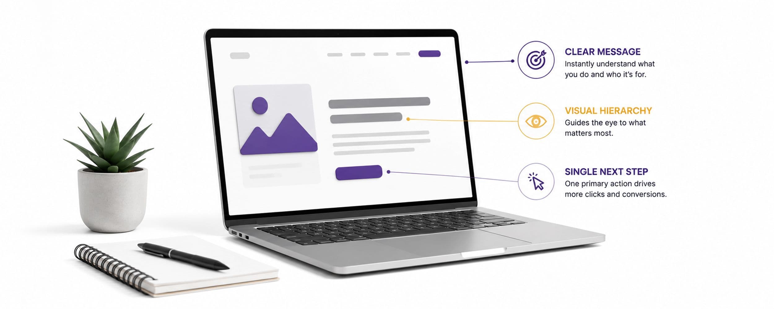
The fix is rarely more content or a faster server. It is fewer choices, presented more clearly. One clear headline stating what you do. One primary call to action, not three competing for the same click. A visual hierarchy that tells a visitor's eye exactly where to look first, second, and third, rather than leaving five elements shouting for attention simultaneously. None of this requires new technology. It requires being willing to remove things from a page that a stakeholder liked but a visitor's brain never asked for.
Picture your homepage with everything currently on it, and then picture it with half the navigation items removed and a single clear next step in place of three. The second version will almost certainly convert better, not because it says less, but because it costs your visitor's brain less to process before deciding whether to stay.
The Internal Meeting Where Homepages Go Wrong
Most bloated homepages were not designed badly on purpose. They were designed by committee, over several rounds of internal review, where every department asked for one more thing to be added: sales wanted a demo button above the fold, product wanted a features carousel, leadership wanted the mission statement visible immediately. Each request was reasonable in isolation. Together, they built a page optimised for internal consensus rather than visitor comprehension. The fix is not a better designer. It is a single person with the authority to say no to additions that make internal stakeholders happy and visitors' brains work harder.
For Marketing and Sales Leaders: Where to Start This Week
The psychology above explains the mechanism. Here is how to apply it directly:
- Count the number of distinct choices on your homepage, navigation items, calls to action, competing headlines, and cut it by at least a third this week.
- Test whether a first-time visitor, someone with no context, can state what you do and what to do next within five seconds of landing. If they cannot, that is the fix to make before any other homepage change.
- Assign one person the authority to say no to internal requests for "just one more thing" on the homepage. Committee-designed pages are the most common cause of the bounce pattern described here.
If you want a structured audit of your homepage against this exact research, our Web Design & UX team runs this assessment with clients.
Getting a visitor to stay past their first snap judgment is necessary, but it is not sufficient. The deeper, more uncomfortable truth is that the real decision about whether to trust your business was mostly made somewhere else entirely, in places your analytics cannot see at all, long before this particular visit even happened. That is where we turn next in this series.
What This Means for Your Business
Count the number of distinct choices on your homepage, navigation items, calls to action, competing headlines, and cut it by at least a third. Test whether a first-time visitor can state what you do and what to do next within five seconds of landing, since that is roughly the threshold before cognitive load starts costing you visitors. Fix visual hierarchy and choice count before spending more on page speed, since a fast page with too many choices still loses visitors for psychological reasons no server upgrade can solve.
Want Help Building This
MagicWorks redesigns homepages around cognitive load, not just page speed. Book a discovery call to see where your current site is losing visitors.