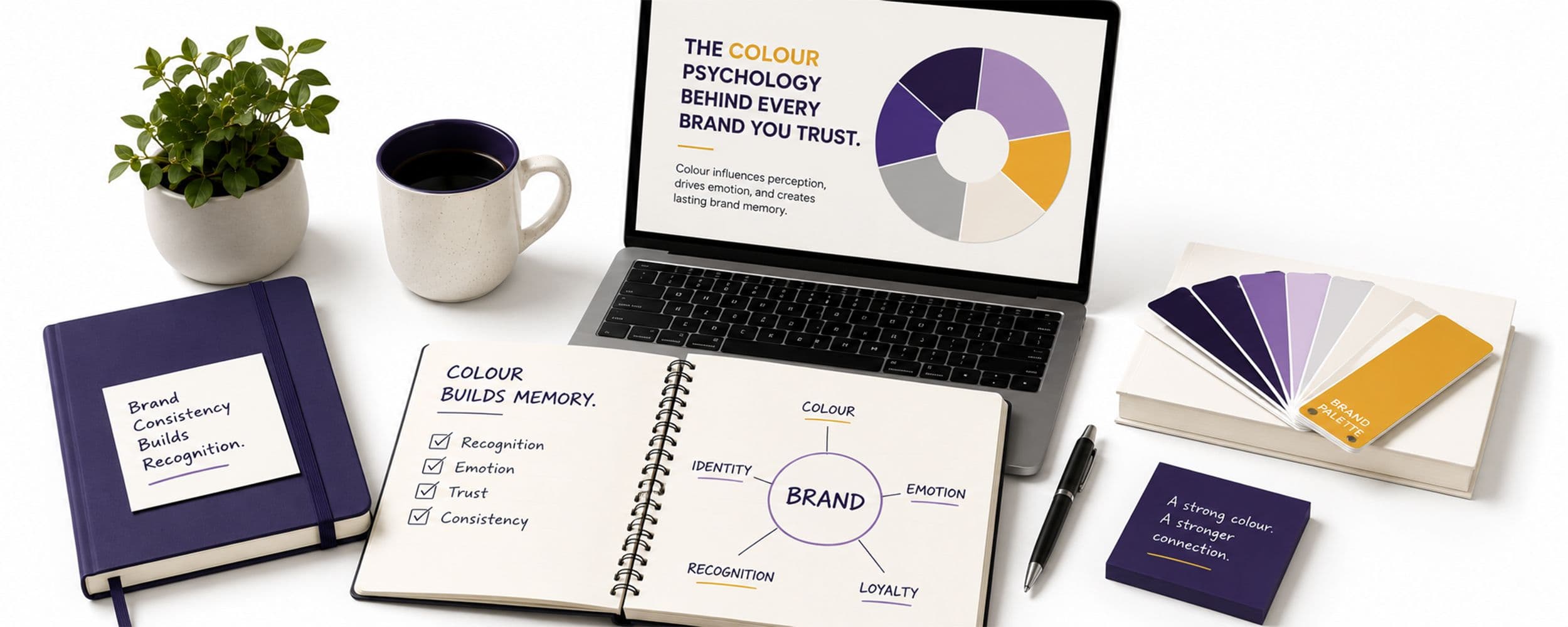
You can tell a Coca-Cola truck from three lanes over without reading a single letter on it. That is not an accident of memory. Colour increases brand recognition by up to 80%, a figure that has held up across more than a decade of research from the University of Loyola and has been reconfirmed in study after study since (Colorlib, 2026). Your customers are not primarily recognising your name. They are recognising a colour, and your name is catching up a half-second later. Colour psychology branding is not a design preference. It is measurable recall infrastructure.
Colour Gets There Before Words Do
The sequence matters more than most businesses realise. Up to 90% of snap judgments about a product are made on colour alone, before a shopper has consciously registered anything else on the packaging or page (Colorlib, 2026, citing CCICOLOR). Separate research puts the figure for first impressions overall between 62% and 90% colour-driven (Amra and Elma, 2026, one of several sources in this piece from a marketing content site rather than an academic body, treat the specific figures as directional). Colour perception activates the amygdala, the brain's emotional processing centre, directly and immediately, which means you feel something about a brand's colour before your rational mind has had any chance to evaluate it (ColorUXLab, 2026, another source of similar provenance).
This is why 85% of consumers cite colour as the primary reason they choose one product over another on a shelf, and why colour-driven purchase decisions can happen up to 44% faster than decisions triggered by neutral-coloured displays (Colorlib, 2026; Amra and Elma, 2026).
The Gap Between What People Remember and What They Read
Here is the number that should worry any business still treating its logo's colour as a design afterthought. 81% of consumers can recall a brand's colour, while only 43% can recall its actual name (Amra and Elma, 2026). Your colour is doing more of the memory work than your name is. If your brand's palette shifts every time you launch a new campaign, chasing whatever looks fresh that quarter, you are quietly sabotaging the one asset working hardest to keep you in your customer's head.
Why the Same Colour Means Different Things in Different Categories
Colour psychology is not a universal dictionary where blue always means one thing and red always means another. It is contextual, and its power comes from what a colour signals relative to the category it sits in. Navy blue creates trust and stability, which is why more than three quarters of major banks build their identity around it (Colorlib, 2026). Red stimulates appetite and urgency, which is why fast food brands lean on red and yellow combinations almost universally. Black reads as premium, and logos rendered in black are perceived as roughly 50% more luxurious than the same logos in other colours (Colorlib, 2026). None of this is arbitrary. Each colour is borrowing a psychological association that already exists in your customer's mind and attaching it to your brand.
The Cost of Getting This Wrong
Consistency compounds the same way repetition does everywhere else in this series. A study tracking 500 direct-to-consumer brands over eighteen months found that businesses using a single, consistent signature colour across every paid, organic, and packaging channel achieved 3.4 times higher brand recognition scores than businesses that varied their palette by campaign (Amra and Elma, 2026). The businesses losing ground here are rarely making a bad colour choice. They are making a different colour choice every few months, which resets the recognition clock before it has had time to build any real memory.
A Test Worth Running on Your Own Team
Ask five people on your team, none of them from design or marketing, to name your brand's exact primary colour without looking anything up. If you get five different answers, or a lot of hesitation, that tells you something important: the colour has not been used consistently enough internally to become automatic, and it is almost certainly not automatic for your customers either. This is a cheap, fast way to diagnose a problem most businesses only notice once a rebrand or a new campaign has already diluted years of accumulated recognition.
For Marketing and Brand Leaders: Where to Start This Week
The research above explains why consistency matters more than a fresh look. Here is how to act on it:
- Run the five-person colour test above this week, and treat any inconsistency in the answers as a live problem, not a minor curiosity.
- Audit every channel where your brand appears, website, social, packaging, presentations, sales decks, for genuine colour consistency, not just approximate similarity.
- Resist changing your primary colour for the next campaign refresh. The compounding recognition benefit described above only builds over years of consistent use, and resets with every change.
If you want a structured audit of your current colour consistency and a plan to fix it, our Brand Identity Design team works through exactly this with clients.
What This Means for a Brand Like Yours
You do not need a rebrand to benefit from this research. You need discipline. Pick a signature colour that fits the emotional territory you want to own, and then use it with almost boring consistency, across your website, your social presence, your packaging, your presentations, everywhere a customer might encounter you. Colour gets you noticed and remembered before anyone reads a word you have written. But colour alone rarely explains why an entire brand becomes part of culture. For that, you need words built to survive being repeated a million times, which is exactly what a good tagline does. That is where we turn next in this series.
What This Means for Your Business
Audit every channel where your brand appears, website, social, packaging, presentations, and check whether your primary colour is genuinely consistent or drifting by campaign. If your team cannot agree on your exact brand colour without checking a style guide, your customers cannot either, and you are losing the fastest, most reliable recognition tool available to any brand.
Want Help Building This
MagicWorks helps businesses build and enforce colour consistency that actually compounds into recognition. Book a discovery call to audit your current brand colour usage.