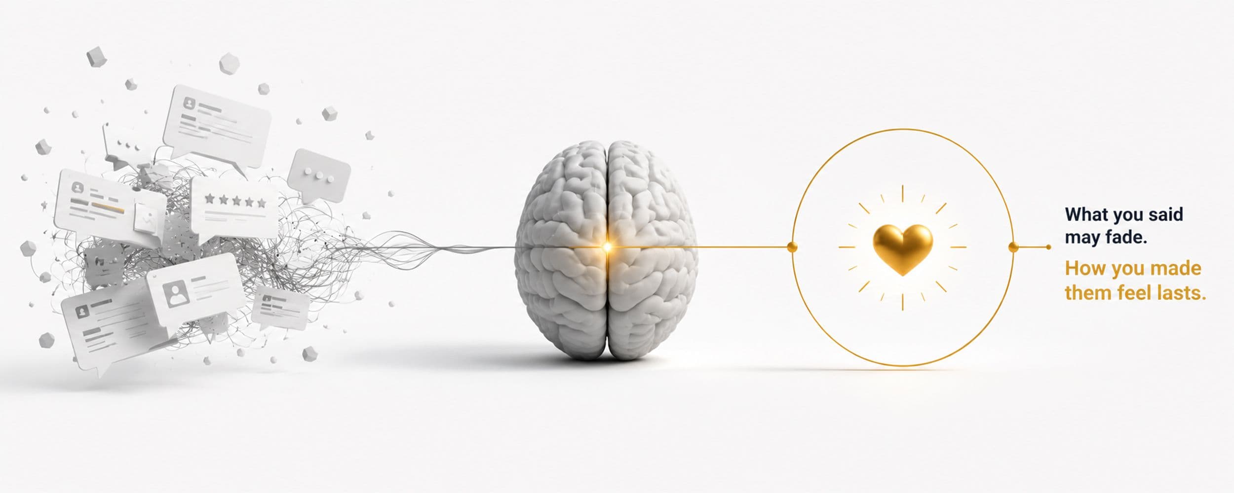
Before a visitor reads a single word on your website, or watches more than a second of your ad, their brain has already formed an opinion. Research consistently puts the window for that first judgment somewhere between 50 and 180 milliseconds, faster than a single blink (CXL, 2022; ScienceDaily, 2026). By the time you finish reading this sentence, thousands of potential customers have already decided, without realising it, whether they trust what they are looking at. Understanding this first impression website milliseconds effect changes how you should prioritise design against copy.
The 50-Millisecond Verdict
The original research behind this number comes from a study in which participants were shown website homepages for just 50 milliseconds, a fraction of the time it takes to consciously register a single word, and asked to rate visual appeal. Their ratings correlated strongly with ratings given by a separate group who viewed the same pages for a full 500 milliseconds (CXL, 2022, citing the original Lindgaard et al. research). Visual appeal, it turns out, is not something your brain slowly builds up over a few seconds of careful looking. It is assessed almost instantly, before conscious thought has time to weigh in.
A separate eye-tracking study found that once a visitor's eyes settle on a specific area of a page, that fixation lasts an average of 180 milliseconds, and the longer a visitor's attention stayed engaged during that early scan, the more favourable their overall impression of the site turned out to be (ScienceDaily, 2026). First impressions are not just fast. They are self-reinforcing: a good first 180 milliseconds buys you more attention, and more attention builds a better impression.
Why Design Carries More Weight Than You Think
94% of a visitor's first impression is design-related, not content-related (SAMPS, 2026, a figure worth treating as directional rather than precisely verified, since the underlying research provenance is not independently documented). This does not mean your message does not matter. It means your message does not get a fair hearing if the visual first impression has already told your visitor's brain to stop paying attention. A confusing layout, inconsistent colour use, or a cluttered homepage is not a minor aesthetic issue. It is actively suppressing the very message you built the page to deliver.
Picture two ads running the same offer, the same headline, the same price. One uses a cluttered layout with three competing focal points. The other uses a single clear visual hierarchy that leads the eye straight to the offer. Eye-tracking-informed ad optimisation of exactly this kind has been shown to increase ad conversion rates by up to 28% compared with unoptimised creative, and ads built to trigger a clear emotional response, detectable through neural and biometric testing, make up the majority of top-performing campaigns studied in 2026 neuromarketing research (Amra and Elma, 2026, another source worth treating as directional given its content-marketing rather than academic provenance). The offer was identical. The instant impression was not.
What Buyers Are Actually Judging in That Instant
Your visitor is not evaluating your product in those first milliseconds. They have not read enough to. What they are judging is whether you look credible, current, and easy to deal with, essentially a proxy for trustworthiness built entirely from visual cues: layout, whitespace, colour consistency, and how immediately the page communicates what it is. This is why your brand's visual system, the palette, the spacing rules, the consistency between pages, carries commercial weight long before anyone reads a headline.
The Tab That Never Got a Second Look
Think about the last time you opened five browser tabs comparing vendors for something your business needed. You almost certainly closed two or three of them within seconds, long before reading a single sentence, based purely on how the page looked and felt. Your own buyers do exactly this to you, dozens of times a day, across every ad and every landing page you run. The tabs that survive are rarely the ones with the best offer. They are the ones that pass the instant credibility check first, and only then get evaluated on the offer at all.
Buying Yourself the Next Thirty Seconds
The good news inside all of this speed is that a strong first impression buys you something valuable: attention for the next several seconds, during which an actual message can land. Research on website engagement found that visitors typically give a homepage 3 to 5 seconds to earn deeper trust once that first snap judgment has passed (SAMPS, 2026). That is a short window, but it is enough time for a clear headline and an obvious next step to do real work, provided the first fraction of a second did not already cost you the visitor.
For Marketing and Sales Leaders: Where to Start This Week
The research above explains why design carries commercial weight. Here is how to act on it directly:
- Open your homepage and your top three ad creatives on a fresh screen, close your eyes, glance for one second, and note the very first thing you notice. If it is clutter, competing colours, or nothing in particular, that is what your buyers see too, before they read a word.
- Count the number of competing focal points on your homepage hero section. More than one is asking a visitor's brain to do work it will simply skip by leaving.
- Fix visual consistency before you rewrite copy. New headlines and offers will not get a fair hearing if the instant credibility check has already failed.
If you want a structured audit of your current visual first impression against this exact research, our Web Design & UX team runs this assessment with clients.
Once you have earned that window, what you put inside it matters just as much as how fast you earned it. And the format that wins that next stretch of attention is rarely the one loaded with specifications and numbers. That is where we turn next in this series.
What This Means for Your Business
Look at your homepage and your top ad creative through the lens of the first 50 milliseconds, not the first paragraph. Ask whether the layout, colour consistency, and overall visual clarity signal credibility instantly, because your message never gets read if the first instant fails. Fix visual consistency before you rewrite copy. The copy only gets a hearing after the visual verdict has already passed.
Want Help Building This
MagicWorks audits and rebuilds websites and ad creative around the instant credibility check buyers actually run. Book a discovery call to see how your current design performs.